Thursday, August 6, 2015

Magazine Project-Final

The magazine project was our final for this class. The title we made earlier in the year was to be our title for this magazine. We could change the look, but not the theme. I had such a blast with this one.


There were several papers in a packet we needed to fill out before we could start really sketching ideas. My professor wanted to make sure we really knew what my end goal was for the overall view of the magazine.


Above are a few sketches. I had several pages plastered with ideas for all the pages I would need to design. I knew I wanted this to flow, and be my best project yet.


My cover was a challenge, partly because I had to change my original title design, and partly cause it's just challenging doing something like this for the first time. But it was fun. Above was my first draft I presented to critique day. I was still working out many of my article ideas, and what exactly I wanted my main focus to be. Below is my original Table of Content pages.


Above these two pages were side by side and wasn't a bad start. I thought they would be the easiest ones to do. While they progressively changed and had their own challenges, they were the easiest.


 Above was my third page. I wasn't really sure what to put there so I thought a nice note from the editor wouldn't look bad. Turned out fun to write.


A special thanks was mandatory, so I took the bios from the bloggers I took my stories from. This page was a struggle, and looking back I probably could have been ok going a little more simple.

By the second critique day I had most of my pages completed and had made some minor adjustments on the older pages. Above, my cover picture changed. I was trying to lighten it with a more airy picture. My title went back to resembling more of the original title design. Since the older pages didn't have many changes made, I'll skip those and show you the rest of the magazine pages.


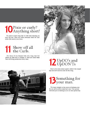
These next two pages were my first actual article. I was struggling with not having enough white space and getting all the info in there.

I knew these two pages would need a lot of work.


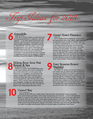
Pages 8, above, and 9, below, were in the middle. I wanted them to be dark and heavy. They were suppose to be a stark contrast to the rest of the magazine which was suppose to be light and airy.


This was my first stab at achieving that goal, and it was very heavy. I knew it would need some adjusting.


This page, above, was the start of a four page article. It was a lot of information, but was a nice lead way into what I wanted to do with the other pages.


Page 11, above, had to be just as light as page 10 since they were next to each other, but I wanted there to be more life. I wanted to add more excitement to the over all feel of both pages without over powering one way or the other.


I had fun playing with the title of these articles. Page 12 was one of my favorites.

This was my favorite section to work on. At the end of this critique I was still two pages and a back cover short. I had to have a final to present shortly there after. I felt great with the results.


I was so thrilled with my final product, despite the printing processes being a nightmare. I'm still proud of what I was able to achieve. This was my first time working on a project this large. I know it still has some work that needs to be done on it, but for where I was at back then, this was amazing work for me.

Metaphor Cover

At my college there was an art book sold every year put together by a committee of students to show current students best work. You had to submit your work and it was judged to see if it was good enough to make it in that years edition of Metaphor. Every year there was also a competition for the cover art. If you won you got a cash reward. My professor always made that competition an assignment. The year 2013's theme was air.


Unfortunately with several moves since then, I've lost a lot of my work with this one. Above is the start of my brain storming. Below I've narrowed down my ideas. I think it was a fantastic idea, I just needed more time to work out the kinks.


I decided to interpret air as what we breathe instead of the element. My idea was to use a heart beat as my main focus. There were certain things that had to be included in the cover, like the name Metaphor as well as the school name and the year.


My first attempt wasn't too bad. I surprised myself. Obviously I still needed a lot of work, but at least I felt confident with my progression. This was a lot of fun to work on.


In the end I still needed more time to work on it. That's usually how it goes with life as a full time student. Overall I'm happy with it.

Type Specimen

This assignment was a challenge. We were given a list of 30 typeface types and info. I was told to choose 8 of those typefaces and create a poster about them. 


I wanted my poster to be unique and so I did a lot of research, and many sketches before deciding on a battle plan I wanted to pursue. Above is a few.


Above is my design I decided on for each individual typeface. Since each type had to be the same as much as possible, I ran into a few problems.


I played around with placement for awhile. Above you can see some of my earlier attempts. None of them were really flowing for me. I was frustrated by the time critique day came around. I was open to suggestions. To my surprise my professor was really impressed with what I had come up. We talked about the potential it had for a long time.


I changed the flow of my poster altogether and found that the results were more to my liking. Above is my first attempt.


Above is my final design. I was very happy with it. One of my best in this class.

Weather Report

As mid terms were nearing I was enjoying this class a lot. I had learned more than I thought possible in a semester. This next project was a basic exercise. Similar to another assignment from my experimental typography class, we had to create a set weather report in a 3 x 3 grid format.


We had 15 minutes to get all of our information in the grid and make it look good. Above is what I came up with. At the time I was feeling good with it, but I'm glad we had another chance to improve it.


After a class critique We had another 15 minutes to fix what we wanted to before turning it in. I was more satisfied with my final product, as shown above.

Type Face Rule # 3 Poster

There some 15 rules to when it comes to typography that every graphic designer should understand. As a class we each took one rule and created a poster about our chosen rule.


My rule was to be mindful not to use too many typefaces at one time. Above was one of my many sketches to get me started. Below is the final sketch that I decided to work with.


By the time I decided on this design, all I had left to do was to clean up the finished design.


As is the case in many cases, as you work on a project your ideas evolve and become something new. Above is one basic idea of my original sketch that I liked.


 I liked it so much I started playing around with coloring. Above and below were just a couple ideas.


After talking with my professor I decided to follow my own rule and use a few less typefaces to prove my point. I came up with what is below.


After I figured out my final basic design, I decided to add color to bring more life to my poster.


I really liked where I was going with the poster above. I wanted it to have a western feel. I was toying with the idea of changing the look to be more like a wanted poster.


After taking a break from my own project and looking at what others were doing I realized my idea wasn't that unique. The brown background was very popular. I decided to leave that idea behind for another project and explore different color ideas. Above is what I finished with. I feel like it still needs some adjustments, but over all I was really happy this finished product.