My Next Assignment was to research current logos. Once we came to class with a few in mind that we liked, we were asked to then improve one of them. As you can see I choose American Diabetes Association. Already a pretty solid logo, but I plunged ahead. Although I feel I had a rough start, I think I had a pretty good end result.
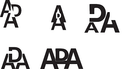
I think I had a really rough start. No ideas were coming. Honestly I ended up throwing something together last minute just so I wouldn't get docked participation points. I'm kinda embarrassed by these. Below are more designs that started coming after talking with my professor at greater lengths.
After playing around with more ideas I started to feel better about this whole project and narrowed down some of my better designs. I had more, but these were the best by far.
I thought I had some winners above. My professor liked what he saw, but only because it had potential. I had some more long talks with him, and after a few stressful nights I was able to produce what I called a winning design! After Deciding on a winning design, I had to figure out how to add color. Obviously Red was a must.
I played around with color for a little bit. But it didn't take long to realize what worked and what didn't with my design.
We were counseled to keep it simple. If it looked good in black and white, then the colors would naturally flow. Below are my finished designs.


No comments:
Post a Comment