Thursday, August 6, 2015

Anatomy Poster

After we completed our magazine title, we were informed that we were to use our title as our main subject in a poster defining various typeface characteristics.


My professor was a big stickler for hand drawn rough drafts. Actually pretty useful habit to get into for me. Above is some ideas I came up with.

This was my first attempt at a "winning" design. I still like the idea, but my professor wasn't happy with it at all.


I tried a second quick idea, and thought it had potential, but I was running into a lot of road blocks. I was running out of time, so I changed it once again.


In the end I played it safe and turned in a basic design. I wasn't overly excited about turning it in, but I did fulfill the requirements. It was a learning experience that I would love to go back and try again.

Wednesday, August 5, 2015

Magazine Title


There are times I wish I could go back and fix some of my assignments. Maybe spend more time on them at least. This is one of those projects. The assignment was to create a magazine title. The title and typography should reflect inside each other.


Since I was in the middle of planning my own wedding a lot of this semester revolved around wedding bells in some form or another. Below I had decided on a finished title name as well as design.


I really liked it, but later for various reasons decided to go with a different a different route.


The biggest reason for changing was due to my professors insights about turning the capital T into locks of hair. Needs more work, but I think it turned out alright.

Word Art

In the Fall of 2013 I took my first load of upper division classes. This beginning typography class was hard work. I felt like I was struggling through out the entire semester, but by the end I felt like I was finally catching on and didn't want the class to end. Below was my first assignment. The assignment was to start with a word and create three different type studies of that word. The first study was to convey what the word actually was. The second was to convey something completely opposite. The third study was to describe what the word was. We were to repeat this with three different words.


My first word was obviously Kryptonite. Honestly, this was the best one I think I did.


My second word, Lingerie, was ok, but I could have done better.


White Collar I think worked out pretty good. I'm still not sure I totally understand what this assignment was all about, but I got a good grade and that's what I really cared about at the time.

Final Project

This was a semester project that was frustrating and fun at the same time. We were given a list of approved names of graphic designers to study throughout the semester. I choose Jessica Hische. I loved her style. After we had studied an artist we needed to create a piece that was similar to something they would create. I choose to create a postcard. Below are some hand drawn sketches I worked on.


Below is my scanned in sketches that I updated with Illustrator.


My postcard with some color changes are below.


After I created a project that was patterned after the artist I studied, the last step was to create a poster that showed the history of where I began, who I studied, and the finished product.


I learned a lot during this class. I'm glad it's over though.

Project Magazine

This was near the end of the semester, and I was ready for christmas break. This project was to create four random pages in a magazine, as well as the cover. We were instructed to unify the pages so they were clearly identified from the same magazine. All the pages had to have numbers that stood out. The numbers had to be key numbers to what our magazines were about.

Because it is hard to remember the exact order of how I did these pages, I'm going to start with the cover. Below is the progression of how the cover started and eventually, what it turned into. My Magazine was about people aging. My numbers were those of certain keystone ages.


 The one on the bottom right was my finished design. I had more examples but as I looked at them again, I realized most of the changes were slight color gradation changes. i.e. making the grey darker and lighter. So I decided to just show the bigger changes. Below is my first page, number 16.


16 is a big number for many in the USA. It's the age when you can potentially get your license. Honestly 16 was a hard number to do much with at the time for me.


18 is the age when a teenager can finally say they are an adult. I think 18 went through a few more transitions then 16 did. Honestly I spent more time with this page.


21, the age of legal drinking. Most of what I changed with 21 was basically just the coloring. I played around with a few pictures, but basically this was the only one worth keeping. 


Obviously this page had the most drastic change. I started with 30 because that's the recommended age women should have started a family before. But after playing with it awhile, I realized that all my other pages had to deal with people, not gender specific. So I changed to a more exciting age of 65. At the time that was the age one could finally get social security. This page just flowed together after I made the age change. It was the one I spent the least amount of time on, but it's my favorite. 

So just to recap, above was my original starting design. I was feeling really good about it until after critique day. I knew I had some work to do. Below is what I finished with. 


Looking back I'm sure I could figure out how to get my numbers to have more personality and tie in with my design better. But since this was one of my first big projects like this, I was pretty happy with my results.

Concrete Poems

This assignment was one of my favorites to do. It was a long processes, but every step was exciting.


I started with four poems, mandatory that they were originally written by me. Then we present them inside a 3 x 3 grid format. the grid needed to be noticeable without any guidelines. Above is my first attempt.


After some critiquing and reevaluating my original ideas I changed my design to add more enthusiasm for the readers. Below is the next step of adding color.


 After I had decided on which color scheme I wanted to work with it was all about creating a more unified feel between all the poems.


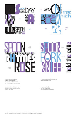
My final product below, was something I was extremely happy with. Of course there is always things that could be changed and tweaked to improve it, but over all I felt like it was finished by the time it was due.